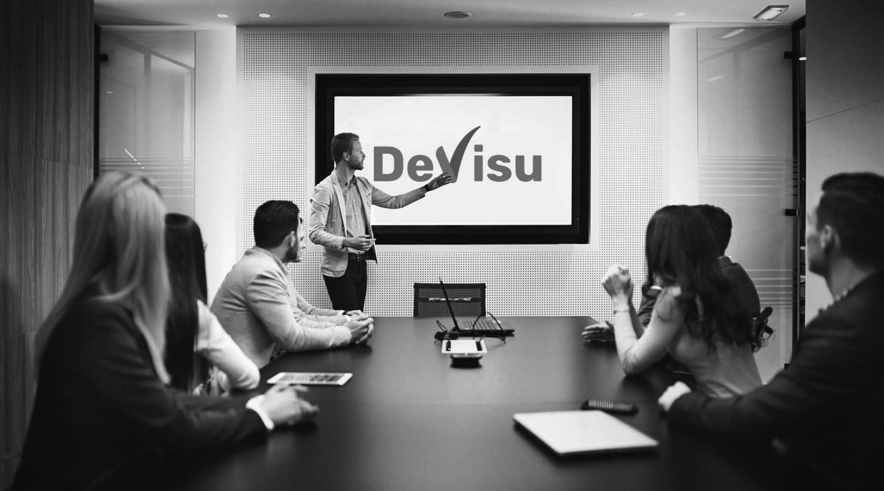
In 2019, "De Visu" Group celebrates its 25th anniversary in the business services market. On the occasion of this event, "De Visu" started a major update of the brand’s visual identity: changed the logo, updated the corporate style and launched a new trendy site using the Identity updated.
Visual rebranding is designed to unite and expand the range of clients, increase their loyalty and trust building. In addition, it was decided to make the logo more modern, leaving its main content.
Modernity, conciseness and relevance are the main components of the new design. Updated corporate style will help to improve the perception of "De Visu", enhance its recognition and highlight it among its competitors.
The basis of the visual image became an updated logo. The company’s first logo was created in 1994. Its name De Visu was encoded in the sign, which means in Latin “to be sure of what you saw”, and the Latin letter V resembled a “tick” – a mark on the plan implementation, checking one of the sections of conditional checklist. The logo had an italic design and had a slightly slope for 25 years. The new logo retains the symbolism of the previous one but has a more modern visual design.
The company has long been in the market, so it has managed to prove itself and is quite recognizable by the logo without any extra details. Thus, the base of the new visual image is the traditional color palette for "De Visu" – red, white, gray and steady set of letters in Latin to denote the group name – De Visu. Considering the tendency to significantly simplify the logos, as well as the attraction to flat shapes, a simple, readable font without a slope was used. Letters have become wider, which symbolizes the position of company with experience.
“We have created not only a new design of corporate identity, but also new senses of communication with all stakeholders. We do not depart from our values, but we show that we are ready to change according to time requirements, to be always in trend. The key tasks of restyling were to keep the logo signs and upgrade it. New visual image should be a concise way of presenting "De Visu" in Ukraine and in the world. At the same time, positioning the company as one of the best in the field of services for business remained unchanged” – Oleksandr Boiko, "De Visu" Group President, says.
“It is important to make the brand modern. On the eve of the 25th anniversary of the company, which to be celebrated in December, we’ve realized that it is worthwhile to add innovation, trendiness and courage to our business. Thus, we’ve developed new elements of the corporate style, which direct the company in the future emphasizing our tradition, reliability and stability. "De Visu" brand grows and develops together with our business. And new corporate style is a vivid demonstration of this” – Iryna Katsal, "De Visu" Group Head of Corporate Communications Department, adds.